Data visualization is the graphical representation of data. In Python, matplotlib.pyplot is widely used for creating 2D charts like line plots, bar graphs, scatter plots, etc. It works well with Pandas DataFrames and NumPy arrays.
✅ 5.1 Importing matplotlib.pyplot and Plotting (2D)
🔹 Importing pyplot
This line imports the pyplot module from the matplotlib library and allows access to plotting functions.
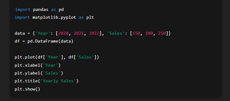
🔹 Basic 2D Plot Example
✅ 5.1.1 Functions Explanation
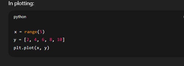
📘 1. range()
Returns a sequence of numbers, often used to create x-axis values.
Syntax: range(start, stop, step)
Example:
📘 2. subplot()
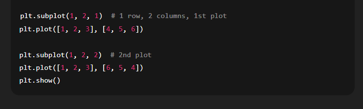
Used to draw multiple plots in a single figure.
Syntax: plt.subplot(nrows, ncols, index)
It divides the figure into a grid of nrows × ncols and places the plot at the given index.
Example:
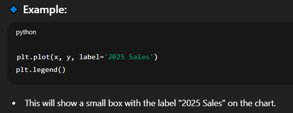
📘 3. legend()
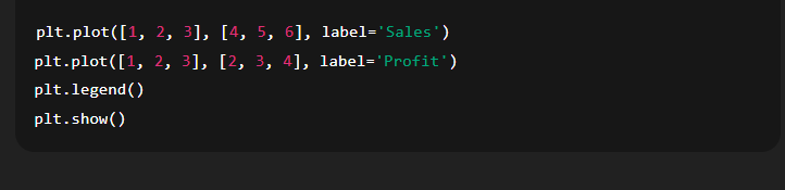
Displays a label for each plot line for better understanding.
It must be used with label= inside plot().
Example:
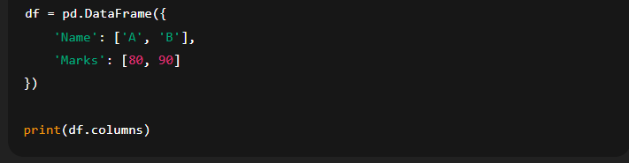
📘 4. columns()
This is a DataFrame attribute that returns the list of column names.
Example:
📘 5. len()
A built-in Python function that returns the number of items in an object.
Example:
Function
Purpose
range()
Creates numeric sequences for axes or loops
subplot()
Displays multiple plots in a single figure
legend()
Adds labels to plot lines for clarity
columns()
Returns column names of a DataFrame
len()
Counts elements in DataFrame or list
5.2 Scatter Plot
✅ Concept of Scatter Plot
A scatter plot is a type of graph used to display the relationship between two numeric variables. Each point on the graph represents an observation in the dataset, with one variable on the x-axis and the other on the y-axis.
🔹 Purpose:
To visualize how one variable affects or relates to another.
To identify patterns, clusters, or outliers.
Commonly used in statistical and data analysis.
🔹 Example Use Cases:
Student scores (Math vs Science)
Height vs Weight
Age vs Income
✅ Creating a Scatter Plot in Python
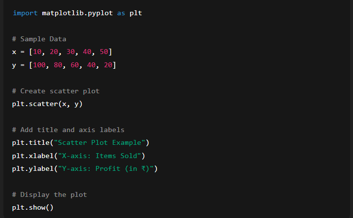
To create a scatter plot, you use the scatter() function from the matplotlib.pyplot module.
🔹 Syntax:
✅ Setting Title and Axis Labels
Adding a title and labels makes the plot more informative.
🔹 title()
Sets the title of the plot.
🔹 xlabel()
Labels the x-axis.
🔹 ylabel()
Labels the y-axis.
Function
Purpose
scatter(x, y)
Plots individual data points
title()
Sets the title of the graph
xlabel()
Sets label for the x-axis
ylabel()
Sets label for the y-axis
Line Chart – Concept and Functions
A line chart (or line plot) is one of the most commonly used charts in data analysis. It helps visualize trends, patterns, and changes in data over time by connecting data points with straight lines.
✅ Concept of Line Plot
A line plot shows data as a series of points connected by straight lines. Each point represents a data value, and the lines help us see movement or change across the x-axis (often time or sequence).
🔹 Common Use Cases:
Temperature change over days
Stock prices over months
Sales growth over quarters
✅ 1. plot() Function
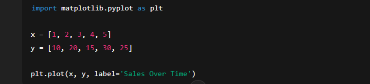
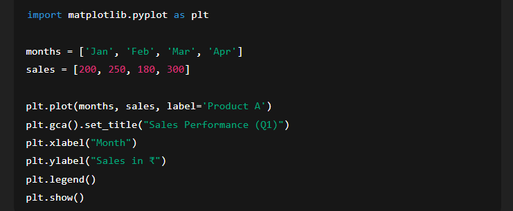
The plot() function is used to create a line graph in matplotlib.pyplot.
🔹 Syntax:
x: Values on the x-axis (e.g., months, years)
y: Values on the y-axis (e.g., sales, prices)
label: Optional; used to define a name for the line when using legend()
🔹 Example:
✅ 2. set_title() Function
Used to set the main title of the chart. It makes the graph more understandable by describing what it represents.
🔹 Syntax:
🔍 plt.gca() gets the current axes (the plot area), and set_title() applies the title to it.
🔹 Example:
✅ 3. legend() Function
The legend() function displays the labels for different plotted lines on the chart. It is helpful when comparing multiple lines.
🔹 Syntax:
📘 Complete Example:
Function
Description
plot()
Draws a line chart using x and y values
set_title()
Sets the main title of the plot
legend()
Shows the label(s) of the plotted line(s)
📊 5.4 Histogram Chart – Concept and Functions
A Histogram is a type of bar graph that represents the frequency distribution of a dataset. It is used to understand the spread and shape of continuous numerical data.
✅ Concept of Histogram
A Histogram displays how often different ranges of values occur in a dataset. These ranges are called bins. Unlike a bar chart, where each bar represents a category, each bar in a histogram represents a range (interval) of values.
🔹 Purpose:
Shows the distribution of a dataset
Highlights frequent and infrequent values
Helps to identify patterns like skewness, peaks, gaps, or outliers
🔹 Real-life Example:
A histogram showing the marks of students can help see whether most students scored between 40-60, or if the scores were spread widely.
✅ 1. hist() Function
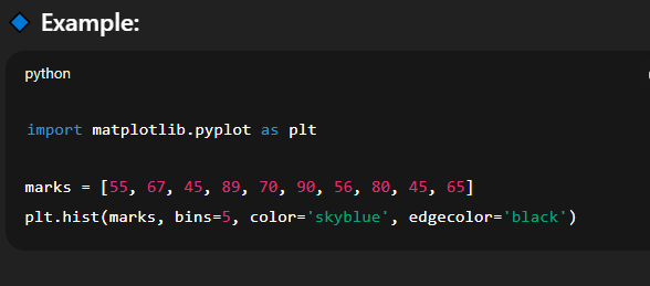
The hist() function in matplotlib.pyplot is used to plot a histogram.
🔹 Syntax:
🔹 Parameters:
data: List or array of numeric values
bins: (Optional) Number of bins (intervals)
color: (Optional) Fills the bars with a specified color
edgecolor: (Optional) Color of the bar edges
✅ 2. set_title() Function
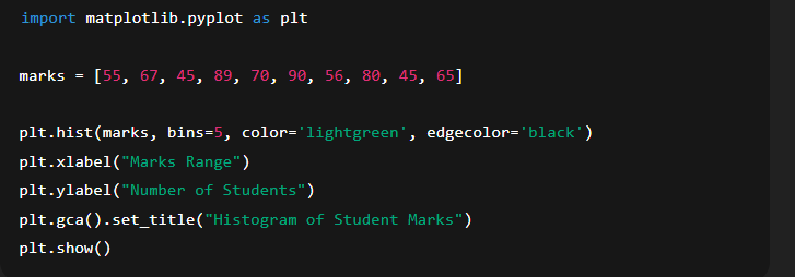
The set_title() function sets the main title for the histogram, helping viewers understand what the chart represents.
🔹 Syntax:
plt.gca() accesses the current axes object where the title will be set.
🔹 Example:
✅ 3. xlabel() and ylabel() Functions
🔸 xlabel():
Sets the label for the x-axis, usually representing the data range (bins).
🔸 ylabel():
Sets the label for the y-axis, usually showing the frequency or count.
🧪 Complete Example:
Function
Description
hist()
Plots the histogram using numerical data
set_title()
Sets the main heading/title of the chart
xlabel()
Sets the label of the x-axis (data bins)
ylabel()
Sets the label of the y-axis (frequency)
5.5 Bar Chart
✅ Concept of Bar Chart:
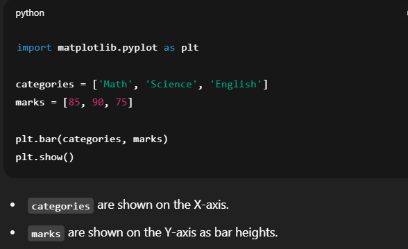
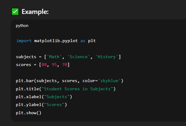
A bar chart is a graphical representation used to display and compare the frequency, count, or other measures (like average, total, etc.) of different categories using rectangular bars. Each bar’s length or height is proportional to the value it represents.
Bar charts are commonly used to:
Compare data between different groups.
Represent categorical data clearly.
Visualize survey responses, sales reports, etc.
✅ bar() Function:
The bar() function from matplotlib.pyplot is used to create bar charts.
✅ set_title() Function:
This sets the title of the chart to describe the content or data being shown.
✅ xlabel() and ylabel() Functions:
These label the X and Y axes, respectively.
📌 Summary:
Use bar charts to visualize comparisons among categories.
Use bar() to draw bars, title() for chart heading, and xlabel() / ylabel() for axis labels.