
Explain Bootstrap Grid System.
SOLUTION....
The Bootstrap grid is a responsive, mobile-first system that uses rows and columns (based on Flexbox) to arrange page content into a 12-column layout that adapts across screen sizes.
Core concepts
Container: Wraps your grid. Use
.container(fixed max-width at breakpoints) or.container-fluid(full width). There are also breakpoint-specific containers (e.g.,.container-md) for hybrid behavior.Row: Use
<div class="row">to create a horizontal group of columns. Rows clear negative margins and manage gutters.Columns: Use
.col-*classes inside a row. The grid has 12 columns; column classes specify how many of those 12 units the element should span (e.g.,.col-6= half width).Responsive prefixes: Add breakpoints to change behavior at different widths:
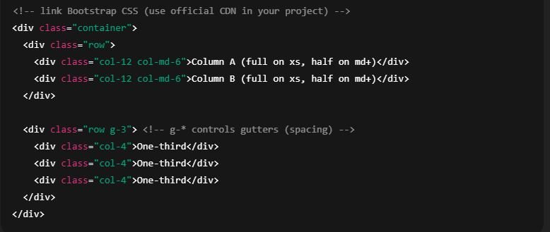
sm,md,lg,xl,xxl. Example:.col-12 col-md-6→ full-width on small screens, two columns on medium+ screens.
Breakpoints (how to target sizes)
Common breakpoints (Bootstrap convention) map to minimum widths:
sm— small screens and upmd— medium and uplg— large and upxl— extra large and upxxl— extra extra large and up
You write classes like .col-sm-4, .col-lg-3 to control layout at each breakpoint.
Basic example (HTML)
Useful features & utilities
Auto-width columns:
.col(no number) creates equal-width columns that share available space.Row-cols helpers:
.row-cols-2,.row-cols-md-4let you specify how many equal columns per row responsively.Gutters: Control horizontal/vertical spacing with
g-0,g-1,g-2, … orgx-*/gy-*for x/y individually.Offsets: Shift a column to the right:
.offset-md-2adds space equal to 2 columns atmdbreakpoint.Ordering: Control visual order with
.order-0,.order-1, … and responsive variants.order-md-2.Alignment: Use Flex utilities on
.row:Horizontal:
justify-content-start|center|end|between|aroundVertical:
align-items-start|center|endAlign individual column:
align-self-*
Nesting: Put a
.rowinside a.colto create nested grids.Hide/Show columns: Combine grid classes with utility classes (
d-none d-md-block) to show/hide at breakpoints.