import pandas as pd
import matplotlib.pyplot as plt
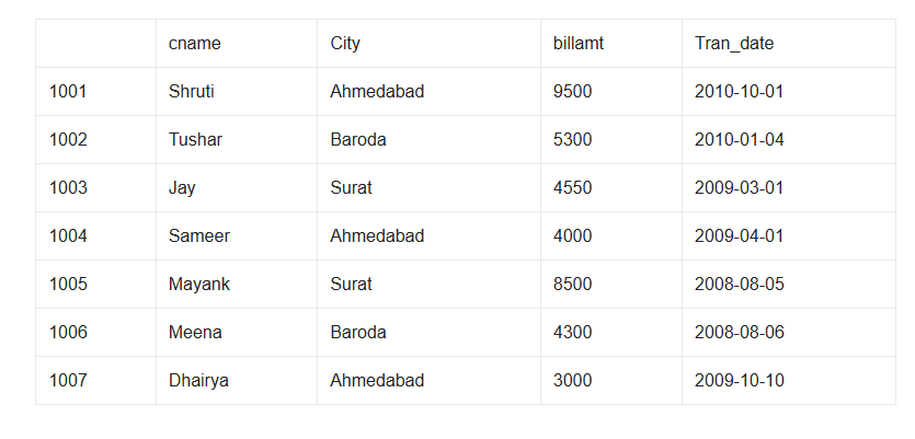
d={'cname':['Shruti','Tushar','Jay','Sameer','Mayank','Meena','Dhairya'],
'city':['Ahmedabad','Baroda','Surat','Ahmedabad','Surat','Baroda','Ahmedabad'],
'billamt':[9500,5300,4550,4000,8500,4300,3000],
'tran_date':['2010-10-01','2010-01-04','2009-03-01','2009-04-01','2008-08-05','2008-08-06','2009-10-10']
}
customer=pd.DataFrame(d,index=[1001,1002,1003,1004,1005,1006,1007])
## Add a new column named discount which is 10% of their bill amount.
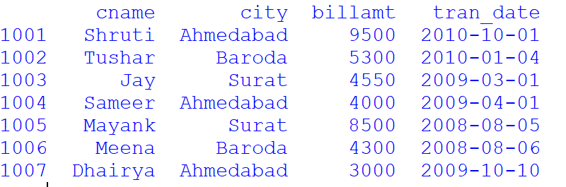
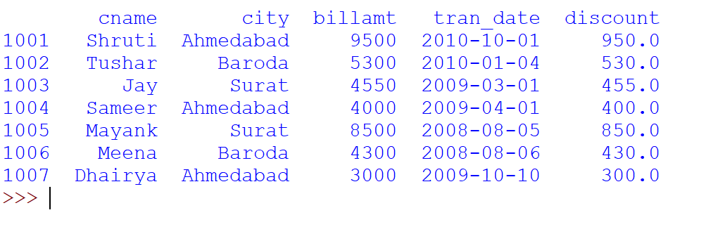
customer['discount']=customer['billamt']*0.10
print(customer)
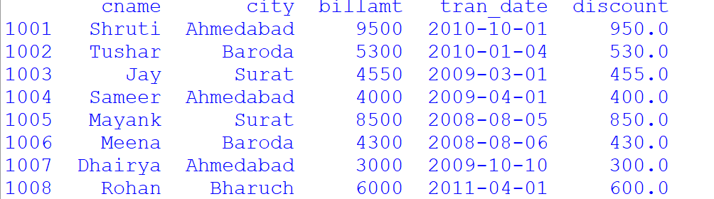
## Add a row with row index 1008 as Rohan,Bharuch,6000,2011-04-01.
customer.loc[1008]=['Rohan','Bharuch',6000,'2011-04-01',600]
print(customer)
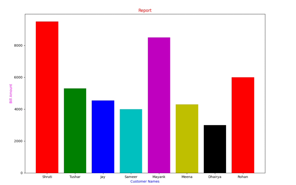
## Now plot a bar chart depicting the customer name on x-axis and
##their corresponding bill amount on y-axis, with appropriate
##Graph title, x-axis title, y-axis title, gridlines and color etc.
plt.bar(customer['cname'],customer['billamt'],color=['r','g','b','c','m','y','k'])
plt.title("Report",color='Red')
plt.xlabel("Customer Names",color='Blue')
plt.ylabel("Bill Amount",color='Magenta')
plt.show()