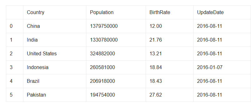
Write a program in python to create the following dataframe named “country” storing the following details:
PYTHON
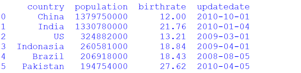
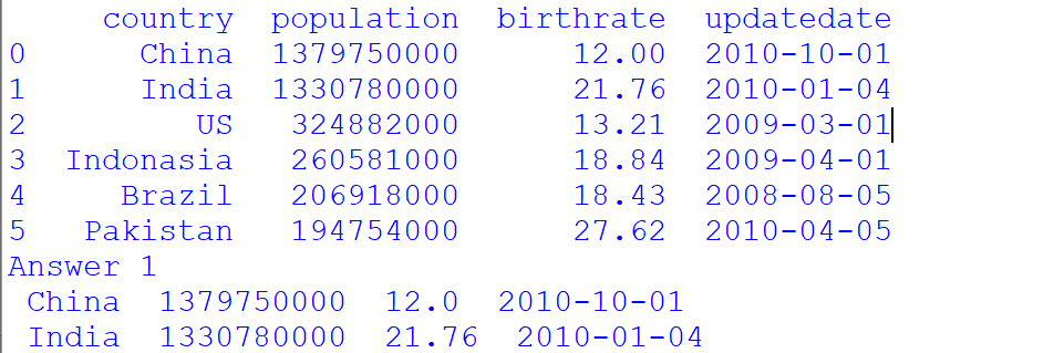
SOLUTION .....
Considering the above dataframe answer the following question by writing appropriatecommand in python pandas:
Display complete data for China and India.
Display Country, Population and BirthRate of Brazil and Pakistan.
Create a CSV File from the above data frame.
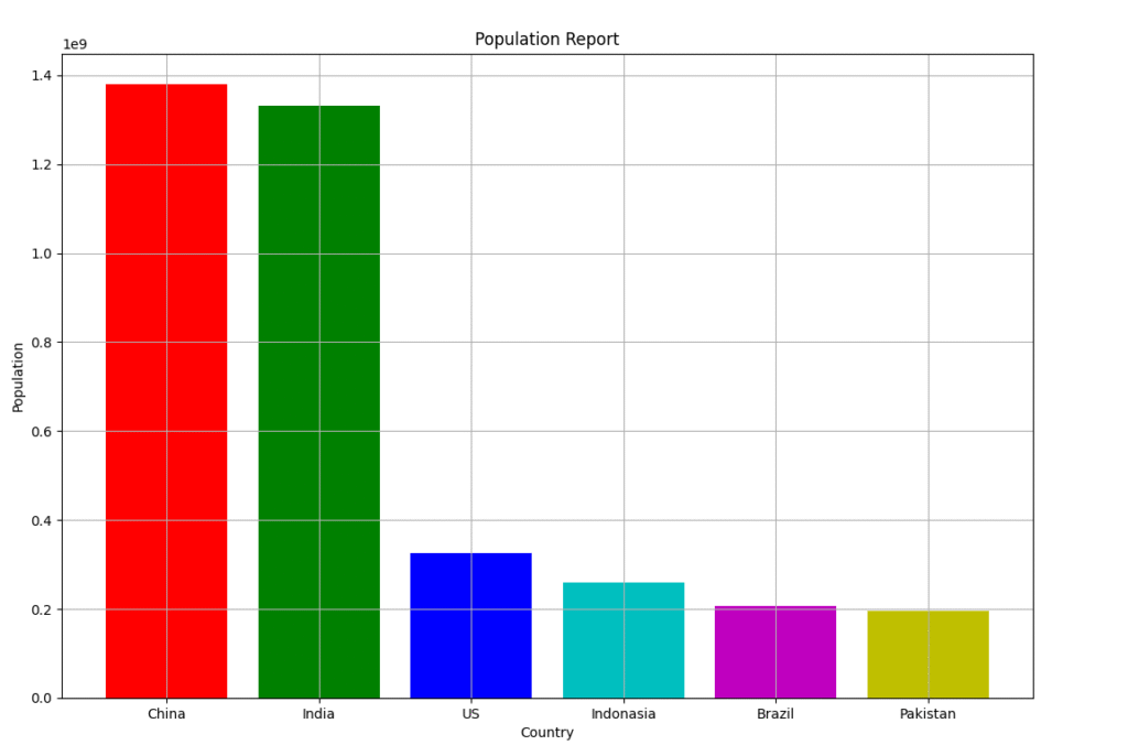
Now plot a bar chart depicting the Country on x-axis and their corresponding Population on y-axis, with appropriate Graph title, x-axis title, y-axis title, gridlines an color etc.