import pandas as pd
import matplotlib.pyplot as plt
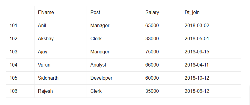
d={'Ename':['Anil','Akshay','Ajay','Varun','Siddharth','Rajesh'],
'Post':['Manager','Clerk','Manager','Analyst','Developer','Clerk'],
'Salary':[65000,33000,75000,66000,60000,35000],
'Dt_join':['2018-03-02','2018-05-01','2018-09-15','2018-04-11','2018-10-12','2018-06-12']}
employee=pd.DataFrame(d,index=[101,102,103,104,105,106])
print(employee)
#Answer 1
print("Answer 1")
em=employee.loc[:,['Ename','Post','Salary']]
print(em[em.Salary>60000].to_string(header=False,index=False))
#Answer 2
print("Answer 2")
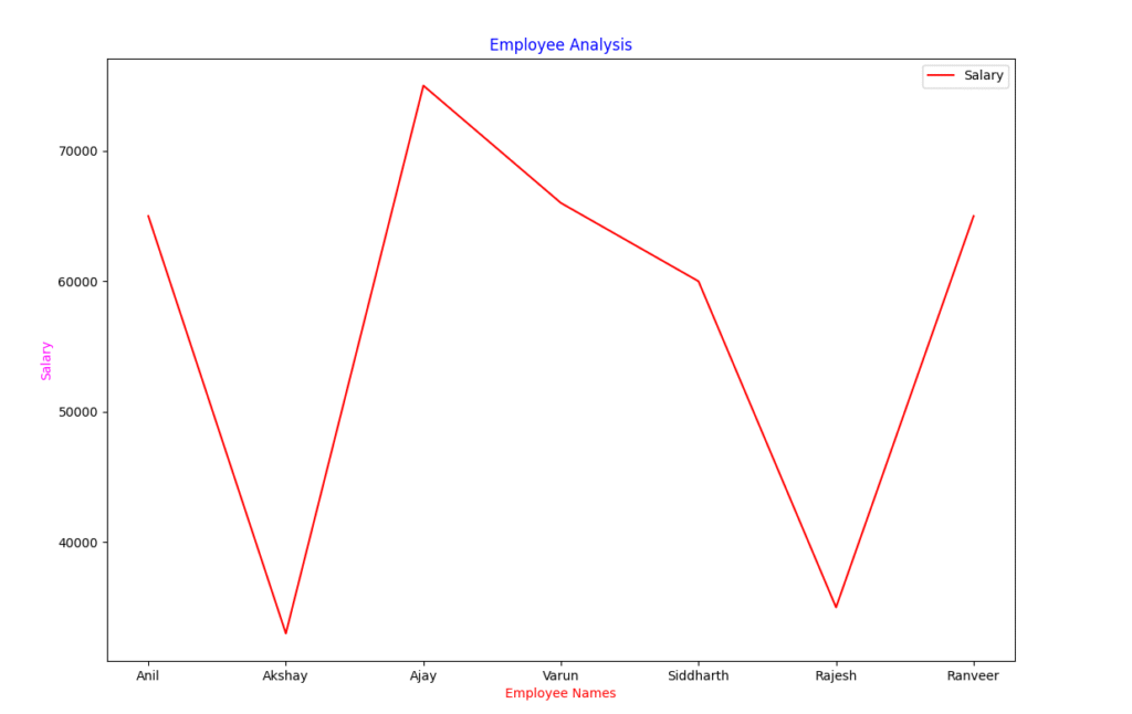
employee.loc[employee.index[-1]+1]=['Ranveer','Analyst',65000,'2020-01-06']
print(employee.iloc[-1])
#Answer 3
employee.to_csv('employees.csv')
#Answer 4
plt.plot(employee['Ename'],employee['Salary'],color='r')
plt.title("Employee Analysis",color='blue')
plt.xlabel("Employee Names",color='red')
plt.ylabel("Salary",color='magenta')
plt.legend(['Salary'])
plt.show()