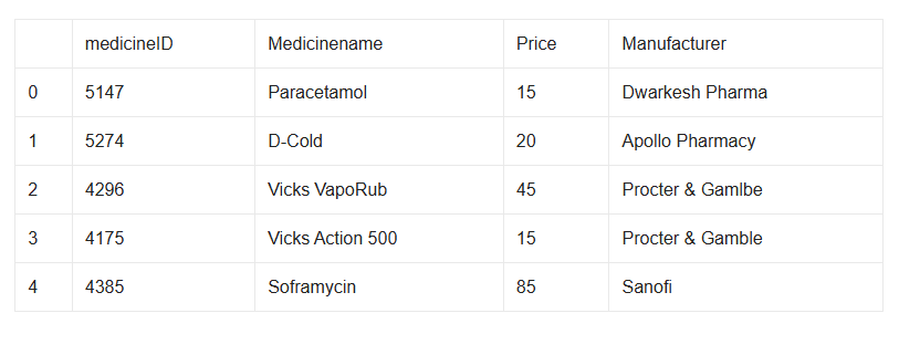
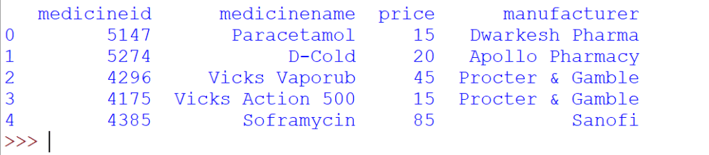
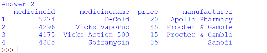
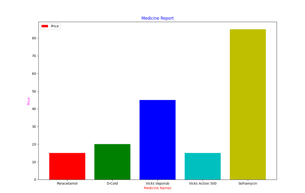
a) create above Data Frame “ved_medicines”b) Display medicines and its price.c) Display last 4 medicinesd) Display records of medicines whose price is more 20e) Draw a bar chart which represent medicine name on x-axis and its price on y-axis.
import pandas as pd
import matplotlib.pyplot as plt
d={'medicineid':[5147,5274,4296,4175,4385],
   'medicinename':['Paracetamol','D-Cold','Vicks Vaporub','Vicks Action 500','Soframycin'],
   'price':[15,20,45,15,85],
   'manufacturer':['Dwarkesh Pharma','Apollo Pharmacy','Procter & Gamble','Procter & Gamble','Sanofi']
}
ved_medicines=pd.DataFrame(d)
print(ved_medicines)
#Answer 1

print("Answer 1")
print(ved_medicines.loc[:,['medicinename','price']].to_string(header=False,index=False))

#Answer 2
print("Answer 2")
print(ved_medicines.tail(4))

#Answer 3
print("Answer 3")
print(ved_medicines[ved_medicines.price>20])


#Answer 4
print("Answer 4")
plt.bar(ved_medicines['medicinename'],ved_medicines['price'],color=['r','g','b','c','y'])
plt.title("Medicine Report",color='blue')
plt.xlabel("Medicine Names",color='red')
plt.ylabel("Price",color='magenta')
plt.legend(['Price'])
plt.show()
Your email address will not be published. Required fields are marked *
Comment *
Name *
Email *
Website
Save my name, email, and website in this browser for the next time I comment.
© Copyright CODEMANIAC STUDIO ™