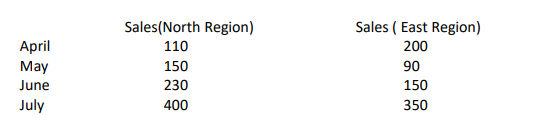
Bajaj Auto has given his sales figures of his North and East Region for the 1st quarter of the financial year 2020. Present the same in the form of bar graph.
Class 12th CBSE IP
Bajaj Auto has given his sales figures of his North and East Region for the 1st quarter of the
financial year 2020. Present the same in the form of bar graph.
Write a program to represent the above given data as a DataFrame ( consider month as indexes) and then print the graph. Put months as x axis and sales (of both region) as y axis. Format the chart according to your wishes.
Solution: –
import matplotlib.pyplot as plt
import pandas as pd
dict1={'north':[110,150,230,400], 'east':[200,90,150,350] }
df=pd.DataFrame(dict1, index=['April','May','june','July'])
print(df)
df.plot(kind='bar', color=['green','orange'])
plt.title("Comparison of Sales Month wise",fontsize=14,color="blue")
plt.xlabel("Month",fontsize=14,color="red")
plt.ylabel("Sales",fontsize=14,color="red")
plt.xticks(fontsize=10, rotation=30)
plt.show()
Fun & Easy to follow
Works on all devices
Your own Pace
Super Affordable
Popular Videos
UX for Teams
Learn the basics and a bit beyond to improve your backend dev skills.
Chris Matthews
Designer
SEO & Instagram
Learn the basics and a bit beyond to improve your backend dev skills.