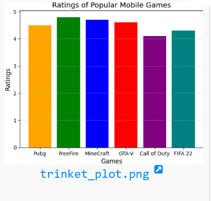
import matplotlib.pyplot as plt

# Sample data
games = ['Pubg', 'FreeFire', 'MineCraft', 'GTA-V', 'Call of Duty', 'FIFA 22']
ratings = [4.5, 4.8, 4.7, 4.6, 4.1, 4.3]

# Plotting the bar chart
plt.bar(games, ratings, color=['orange', 'green', 'blue', 'red', 'purple', 'teal'])

# Adding title and labels
plt.title('Ratings of Popular Mobile Games', fontsize=14)
plt.xlabel('Games', fontsize=12)
plt.ylabel('Ratings', fontsize=12)

# Displaying gridlines for clarity
plt.grid(axis='y', linestyle='--', alpha=0.6)

# Displaying the chart
plt.show()
Your email address will not be published. Required fields are marked *
Comment *
Name *
Email *
Website
Save my name, email, and website in this browser for the next time I comment.
© Copyright CODEMANIAC STUDIO ™