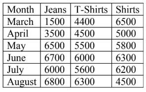
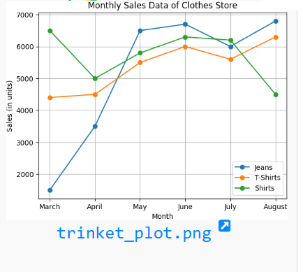
import matplotlib.pyplot as plt

# Data
months = ["March", "April", "May", "June", "July", "August"]
jeans = [1500, 3500, 6500, 6700, 6000, 6800]
tshirts = [4400, 4500, 5500, 6000, 5600, 6300]
shirts = [6500, 5000, 5800, 6300, 6200, 4500]

# Plotting the line chart
plt.plot(months, jeans, marker='o', label='Jeans')
plt.plot(months, tshirts, marker='o', label='T-Shirts')
plt.plot(months, shirts, marker='o', label='Shirts')

# Adding labels and title
plt.title("Monthly Sales Data of Clothes Store")
plt.xlabel("Month")
plt.ylabel("Sales (in units)")
plt.legend()
plt.grid(True)

# Show the chart
plt.show()
Your email address will not be published. Required fields are marked *
Comment *
Name *
Email *
Website
Save my name, email, and website in this browser for the next time I comment.
© Copyright CODEMANIAC STUDIO ™