Python Program to Plot Monthly Sales Data of a Salesman on a Line Chart
Python Line Chart Example | Plot Monthly Sales Data using Matplotlib
SOLUTION ……
import matplotlib.pyplot as plt
# Data
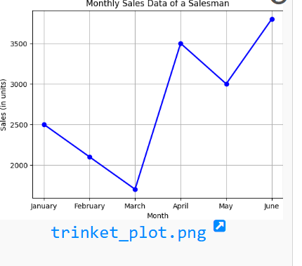
months = ["January", "February", "March", "April", "May", "June"]
sales = [2500, 2100, 1700, 3500, 3000, 3800]
# Plotting the line chart
plt.plot(months, sales, marker='o', color='blue', linestyle='-', linewidth=2)
# Adding labels and title
plt.title("Monthly Sales Data of a Salesman")
plt.xlabel("Month")
plt.ylabel("Sales (in units)")
# Display grid
plt.grid(True)
# Show the chart
plt.show()